Web app coming soon — sign up for early access

What's new

Changelog

0.7.0Web

Rich note editing, and Claude or ChatGPT connected to your day

New features

✍️ Notes in Markdown, styled as you type

Notes have always accepted Markdown; now you can see it as you write. Headings, bold, italic, strikethrough, links, bulleted lists and checklists all style themselves as you type them, and there are buttons for each if you would rather not learn the syntax. Checklists can be ticked straight from the note, without switching into editing first.

🧰 Everything a note needs, in one rail

Formatting, photos, location and note colour now gather into a single rail down the right-hand side of an open note, in place of the separate rows of buttons that used to sit above and below it.

🤖 Ask Claude or ChatGPT about your day

You can now connect an AI assistant to Do Everything from Settings, and ask it what's due, what's still outstanding, or what you wrote down last week. Reading your tasks, lists and notes is free; with PRO your assistant can create and update them too, so you can add a task or tidy a list just by asking. Settings walks you through it — copy your connector URL, add it in Claude or ChatGPT, then choose what it is allowed to do. You can read the full setup guide for more detail — troubleshooting, privacy, and what to ask for.

💾 Know your notes are saved

Notes have always saved themselves as you write, and now you can see it happen: a note tells you once it is saved, and settles back when you have seen it. A save that is taking its time shows itself working, and one that fails says so plainly and offers you a retry rather than leaving you to guess. The mobile app has shown this for a while; web now matches.

Improvements

🖊️ Markdown in task and list descriptions too

Task and list descriptions accept Markdown as well, which is easy to miss. They now style themselves as you type, exactly as notes do.

📖 Notes that are easier to read

Headings, spacing and lists have been reworked throughout, so a long note is easier to take in at a glance, and editing one now looks like reading it.

👀 Cards that preview your words

Cards for notes, lists and tasks previewed the Markdown symbols in your text — the ## and ** — rather than the words. They now show the writing itself.

📌 Everything within reach

Close, Edit, Save and the overflow menu stay with you at the top of a task, note or list however far you scroll, instead of sliding out of sight on a long one.

📜 Slimmer, quieter scrollbars

Scrollbars across the app are slimmer and quieter — a slim handle beside your content rather than a band down the side of it — while staying easy to pick out in every colour scheme, in both light and dark mode.

Fixes

⌨️ Typing that doesn't get lost

Your cursor stays where you left it while a note saves in the background, characters typed during a save are no longer dropped, and a long stretch of writing is saved along the way rather than only once you pause. A note you have just created shows its title and content straight away, instead of looking empty until you reopen it.

🖼️ Photos attached to a note now show

Photos attached to a note did not show up when you opened it — there was no sign they were there at all. They now appear with the rest of the note.

🗓️ Drag and drop that stays put

Drop a task on the empty space beside the Today board and it looked like it had moved, but nothing was saved — and it stayed looking that way until you reloaded the page. The task now goes back where it started.

🎯 Keyboard focus you can see

Moving through Today or Settings with the keyboard sometimes landed you on something hidden behind the bar at the top. Whatever you land on now scrolls into view.

3.11.0Mobile

A clearer view of your day

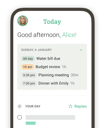
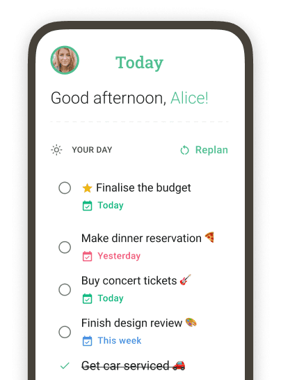
Today has had most of our attention this release: it now shows the shape of your week before you open a single day, and gives every day — behind you, ahead of you, or the one you are in — something to act on.

New features

📅 Task dots on the calendar

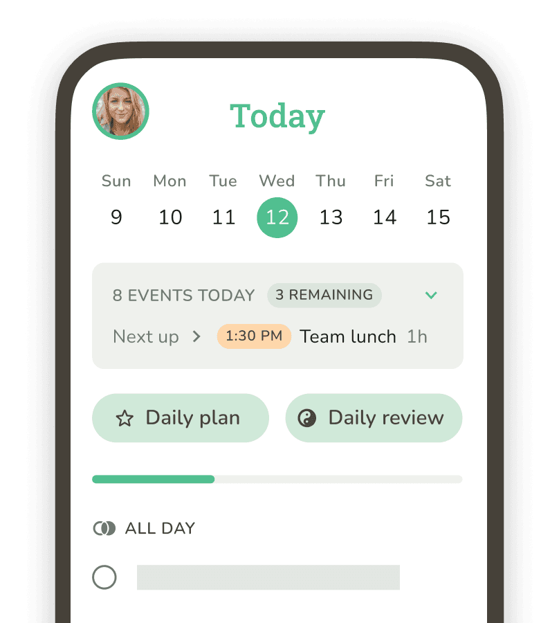
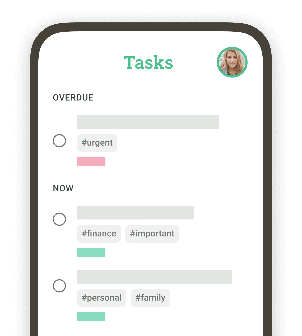
Every date on the Today calendar now carries a dot for how that day stands: everything done, tasks still to do, or something overdue. You can see where your week is heavy without opening each day in turn. If you would rather not see them, Show calendar task dots in the Today menu turns them off.

🌤️ An empty day that offers you something

Every day now meets an empty board the same considered way, with the choices that suit it: today offers both planning and reflecting, a day ahead offers planning, and a day behind you offers a look back. Only today used to get a full pair of cards, while other days made do with a smaller prompt. Now each day gets its own, and every one of them can still take a new task.

✍️ Time-of-day slots you can fill

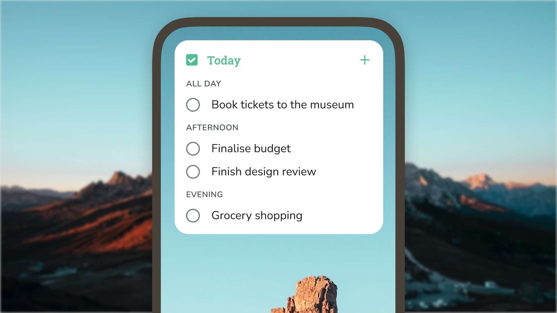
Morning, afternoon, evening and night now show even when they hold nothing, each a compact box you can add a task straight into. On a day ahead, all four wait for you; as today runs on, the ones that have passed drop away; a day behind you shows none. Show empty slots in the Today menu hides them if you prefer a tighter board.

📌 A steadier row of pinned notes

Pinned notes now sit in cards of a fixed height, with any picture as a thumbnail beside the text rather than a band above it. One pinned note with an image no longer stretches every other card in the row.

🖼️ Every cover-image category, and a gentler load

The cover-image picker now groups pictures under every category they belong to, rather than only the first, so far more of the collection is reachable. Covers and thumbnails now ease in from a soft blur instead of appearing all at once.

Improvements

🎉 A more satisfying tick

Ticking a task off now gives a subtle, satisfying flourish, the same one the web app has. A completed task settles into place long enough to see before the list closes around it, and its dates stop calling for your attention.

🇫🇷 French that reads properly

Dates now read the way French dates are written — "le 1er", "le 2" — and the calendar follows the language you chose in the app rather than the one on your device. The invitation screen and reminder notifications are translated as well.

♿ Labels that say what they mean

A handful of buttons announced something unhelpful to a screen reader: Today's view options read out an internal name, the back and menu buttons had none, and the colour swatches read out their codes rather than their names. They now all announce themselves properly, and read-only tags carry a label colour that stays legible on every fill.

📰 Our own changelog, in the app

Settings → Changelog now shows the changelog from our own site, in place of the old Canny board it used to load. The "release notes" link on the What's new sheet opens that same screen rather than handing you to your browser.

🕓 "Any time" says what it means

The slot for tasks with no particular time was called "All day", which claimed something a task in it does not do. It is now "Any time".

Fixes

🔗 Links open the app again on Android

Deep linking broke on Android in 3.10, so links to your Today page and your lists opened in a browser instead of the app. They open the app again.

🗄️ Archived lists stay out of Today

Tasks belonging to an archived list no longer turn up on the Today board.

🌙 The calendar turns over at midnight

The calendar strip could still be showing the previous day after midnight. It now moves on with the clock.

📋 A day with tasks no longer flashes empty

Tapping a date could briefly show an empty board: the time-of-day sections and the add button disappeared until that day's tasks arrived, so a full day looked empty for a moment. The board now waits until it knows a day is genuinely empty before treating it as one.
0.6.0Web

A richer Today board and pinned notes

New features

🕐 Your whole day, ready to fill

Today has always grouped your tasks by time of day; now the empty parts of the day show up too, each with its own add button, so you can put something into your evening without opening the task first. Empty slots that have already gone by drop away, and the part of the day you're in is marked as it passes — something the mobile app has done for a while. The untimed slot is now called "Any time", and you can hide the empty ones altogether from the Today menu.

📌 Pinned notes

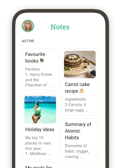
The notes you pin now sit in a strip across the top of the Notes page, as cards with a thumbnail, so the ones you keep coming back to are the first thing you see. Pinning arrived on the mobile app in June, and it's now on web too.

🔵 Your week at a glance

Every date in the calendar strip now carries a dot when it has tasks on it — grey while there's still something to do, red if anything is overdue, and your colour scheme's accent once it's all done. Hover a dot for the count, or switch the dots off from the Today menu.

🎯 Bring Today down to what matters now

Chips for your lists and tags now sit above the Today board — tap one or several to narrow the day to a single project or context, and clear them in one tap. Only the lists and tags that would actually change what's on screen are offered, so the row stays short. Mobile has had this for a while; now web does too.

⚙️ Today, set up the way you want

Today now has a View options menu of its own. Use it to show or hide three things: the list and tag chips above your tasks, the time-of-day sections with nothing in them, and the dots on the calendar strip. Your choices are remembered on this device.

↕️ Completed tasks, in the order you want

Sort the day's completed tasks by most recently finished, earliest first, or title, from that same menu. When you're on anything other than the usual order, a chip above the list tells you which. The same three orderings have been on the mobile app for a while; web now matches.

✨ Every empty day has something to offer

An empty day is no longer a blank board. A day ahead offers to plan it, a day behind offers to look back on it, and today offers both at once — leading with whichever the hour is asking for.

Improvements

🎉 A more satisfying tick

Ticking a task off now gives a subtle, satisfying flourish — a soft wash of colour behind the tick, in whichever colour scheme you're using.

🎞️ Reduced motion, properly honoured

If you've asked your device to reduce motion, the web app now respects that everywhere. Animations that used to ignore the setting now sit still.

🏷️ Note tags that match the app

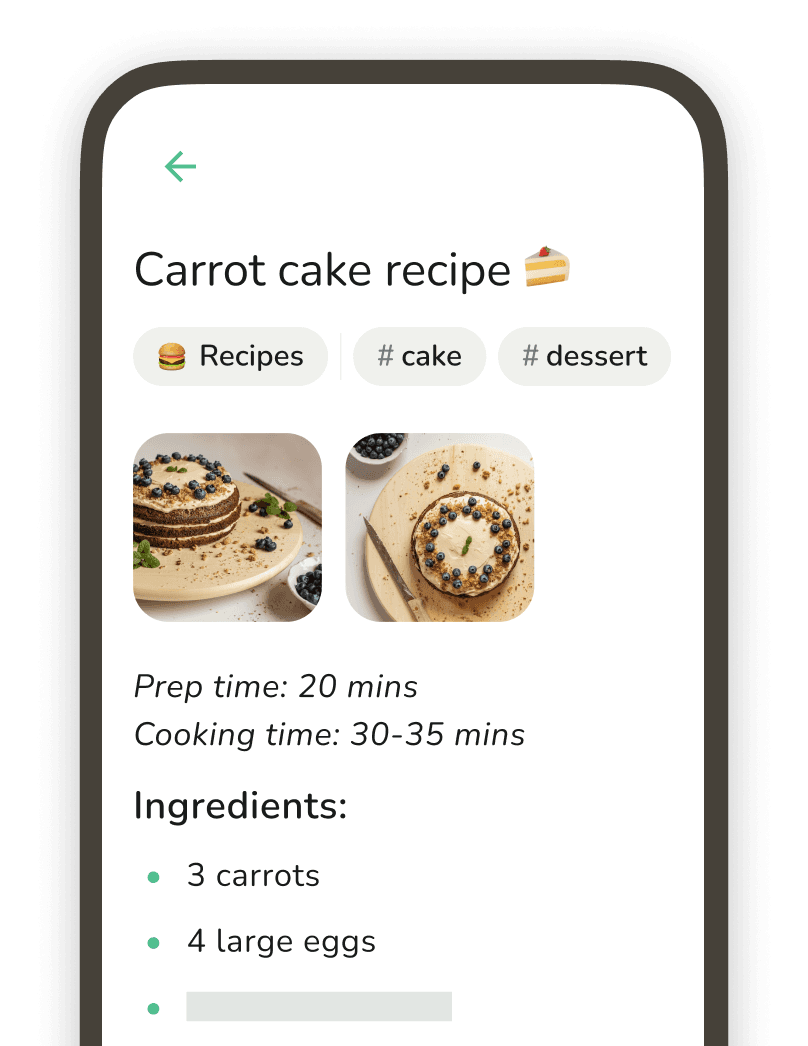
Note tags now use the same compact chips as the mobile app, prefixed with a hash and given a colour that stays readable against every theme.

Fixes

🕰️ Completion times that tell the truth

Completing a task while you're looking at another day now records the time you actually did it, so Today's completed list stays in the order things happened. Subtasks sit beneath their parent there too, and reopening a subtask brings its details back instead of hiding them for good.

🔖 No more raw tag ids

Tags that can't be resolved — usually a collaborator's — no longer show up as raw ids.

🎨 Scrollbars and calendars in your colours

Scrollbars now follow the app's colour scheme, the month calendar's weekday headings use the right colour and case, and coloured notes have a keyboard focus indicator you can actually see.

0.5.0Web

Sign in with Apple and full French support

New features

🍎 Sign in with Apple

"Continue with Apple" now sits alongside Google and email on the sign-in page. If you already use Apple sign-in on your iPhone or iPad, the web app signs you straight into the same account.

🇫🇷 The web app now speaks French

Every page — Today, Tasks, Notes, Lists, Journal, planning and settings — is now available in French, right down to the keyboard-shortcut cheat sheet and the colour scheme names. We follow your browser's language automatically, and you can switch any time from the new language picker in settings.

⚙️ A proper home for your settings

Your preferences now live in one dialog, reachable from anywhere in the app. Set the day your week starts, choose the lists new tasks and notes are filed into, pick your display mode and colour scheme — now matching the mobile app — manage notifications, and look after your account, including sending us feedback and catching up on what's new.

Improvements

🧹 Filters only when you need them

The Done filter on Tasks and the Archived filter on Notes now appear only when there's actually something behind them, keeping the toolbars clean.

Fixes

🛟 Nothing fails silently any more

If completing a task, creating an item or deleting an image doesn't reach the server, we now say so — and put things back the way they were — instead of quietly pretending it worked.

🗣️ Better screen reader support

Screen readers now announce search result counts, loading and saving states, and note image thumbnails, upload progress and lightbox navigation. Dropdowns read out their current selection, and delete confirmations are read in full.

🎨 Sharper contrast across themes

We fixed washed-out placeholder text, made focus indicators consistently visible, and improved text contrast in several themes — including clearer calendar days from adjacent months.

0.4.0Web

Command palette and keyboard shortcuts

New features

⌨️ Command palette

Press Cmd+K (Ctrl+K on Windows) to reach everything from one place — create tasks, notes and lists, jump to any page, or run the actions for the page you're on, all without touching the mouse.

🧭 Go-to navigation

Press g followed by a letter to move between pages instantly — g t for Today, g n for Notes, g l for Lists, and more.

⚡ Shortcuts on every page

C opens the right create panel for wherever you are, / jumps straight to search, and tasks, notes and lists can be saved or deleted from the keyboard. Press ? at any time to see the full cheat sheet, including the shortcuts specific to the current page.

🔔 Know when we've shipped

When a new version lands, a small card appears in the sidebar with a link to what's new — no more wondering whether anything changed.

📱 Get the app from your phone

Visiting the web app on your phone? A compact banner now points you to the iOS or Android app — dismiss it once and it stays gone.

Fixes

🔗 Links open the app again on iPhone

Tapping a Do Everything link — a shared list invitation, or Today from our newsletter — on an iPhone with the app installed now opens the app directly instead of the browser. Android support returns with the next app update.

🎹 Shortcuts stay out of the way

Keyboard shortcuts no longer fire while a dialog is open, and Escape now steps out of note editing before it closes the panel.

0.3.0Web

Collapsible sections and a fresher Today

New features

🗂️ Collapsible sections

Sections now fold away across the app — on Today, in your task and list views, and while you plan — so you can hide what you're not working on. Collapsed sections show a count of what's still inside, so you always know what's left without expanding them.

➕ Quicker ways to add a task

Empty sections now offer an "Add a task" row you can click straight into, and every list section can add a task right from its header — no need to scroll to the bottom of the list.

🌅 A redesigned start to your day

Today's planning and review entry points have a fresh look. On a day with nothing planned yet, illustrated cards invite you to set your focus for the day ahead or reflect on how it went.

✋ Reorder tasks by dragging

Drag and drop to reorder tasks within a list, arranging them in the order that makes sense to you.

Improvements

💾 We'll keep your edits safe

If you have unsaved changes to a task, we'll now warn you before you navigate away — not just when switching to another task — so an edit is never lost by accident.

Fixes

📌 Steady picker actions

Buttons at the bottom of pickers now stay pinned in place while their contents scroll, instead of drifting out of reach.

✨ Tidier task lists

We've smoothed out the spacing and hover behaviour of task rows so sectioned and plain lists line up consistently.

0.2.0Web

Readable long titles and visual polish

New features

📝 Long titles show in full

Long task and note titles now wrap onto multiple lines in the detail panel, so you can read them in full instead of having the end clipped.

Fixes

✨ A more consistent look

We've smoothed out small visual details so the app stays consistent and on-brand as you move around it.

3.10.0Mobile

Pinned notes and default lists

New features

📌 Pinned notes

Keep the notes you reach for most at the very top of the Notes tab. Open any note's menu and turn on "Pin note to the top" — pinned notes lift into a "Pinned" strip above the grid, just like pinned lists. Your pins sync across your devices, and on notes in a shared list they're personal to you, so pinning one changes nothing for the people you share with.

🗂️ Default lists

Pick a default list for new tasks, and a separate one for new notes, in Settings → Defaults. From then on, anything you create from Today, the Tasks or Notes tab, a widget or a quick action lands in that list automatically — so quick capture stays quick and still ends up where you want it. Creating from inside a specific list still takes priority, and the pre-filled list is always editable before you save.

Improvements

⚙️ A smoother, steadier app

We've done significant behind-the-scenes work on the foundations of Do Everything — a more modern, more reliable base that brings smoother performance, better stability and fewer bugs across the app.

0.1.0Web

Do Everything comes to the web

Do Everything is now available on the web, in early access.

New features

🎉 Do Everything, now on the web

Your tasks, notes, lists, and daily planning are here in the browser, synced with your account wherever you sign in. This is an early-access release — we're actively building towards parity with the mobile app, and we'd love your feedback as we go.

3.9.0Mobile

Today filters, sort, week start & polished French

New features

Focus on what matters today

🎯 Quick Filters: Today now shows list and tag chips below each day, derived from that day's tasks. Tap one (or several) to narrow the view to one area of life — work, errands, a specific project. You can turn the chips off entirely from the new overflow menu if you'd rather a cleaner header.

↕️ More Sort Options: Completed tasks on the Today view now have three sort modes — most recently completed, earliest completed first, and Title A–Z — accessed from the overflow menu.

Handy upgrades

📋 Duplicate with Subtasks: Duplicating a task that has subtasks now opens a sheet asking whether to bring the subtasks along too. The duplicated subtasks start fresh — status reset to open — while keeping their original order under the new parent.

📅 Start of Week, Your Way: A new "Start of week" setting under Settings → Appearance lets you pick Sunday, Monday, or "system" (which uses your device language's default — Monday for French, Sunday for British English). The choice flows through calendars, the weekly planning view, the date pickers, and the recurring-task day-of-week picker.

Improvements

🇫🇷 French Widgets: iOS Today widgets now follow your in-app language preference.

Sharper French Translations: A round of fixes based on user feedback.

Also brewing

🌐 Do Everything, on the Web: We're bringing Do Everything to the browser. Join the early-access list to help shape it.